Guides

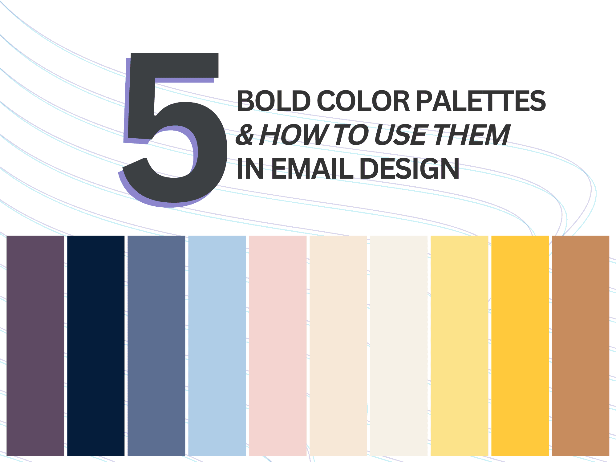
How to Use 5 Bold Color Palettes in Email Design
Harness the power of bold color palettes in email marketing design. Learn how to use color in email, optimize accessibility and create mobile‑friendly, on‑trend email design.

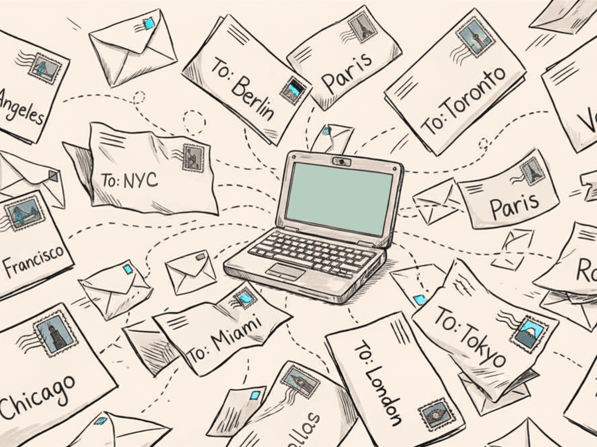
Email marketing design has evolved far beyond simplistic templates. In an era when inboxes are crowded, your messages need to be visually compelling to capture attention.
Did you know that visual hierarchy, layout design, images and color all drive email engagement? In fact, dynamically designed emails see 520% higher response rates. Couple that with the fact that 93% of shoppers prioritize visual appeal. Colors have a profound impact on how people feel as well, considering 85% of consumers cite color as their primary reason for making a purchase.
And yet, using trending colors to create a mobile-friendly, totally accessible email design is a fine line to walk. This is especially true if said colors aren’t necessarily part of your brand.
This guide explores how to use color in email to convey emotion and draw in subscribers. We present five trending email color palettes, with best practices for how to tie them into your accessible email design.
How to Use Color in Email 101: Current Trends & Human Psychology
Color trends reflect broader cultural and design movements. Paris Fashion Week just wrapped and it showcased a range of trending color palettes centered around versatile neutrals, sophisticated pastels and vivid jewel tones. Neutral and earthy hues like Mocha Mousse (Pantone’s official pick for 2025), soft browns and muted beige continue to dominate, while buttery yellow and deep jewel tones add depth and luxury. These palettes are truly where color trends live today.
Beyond trends though, colors convey emotion and meaning. Red raises heart rates and signals urgency. Blue connotes trust, professionalism and relaxation. Yellow expresses optimism. Purple suggests luxury. Brown grounds design with warmth.
With trends and emotional signals in mind, here are ways to include color palettes in email designs for your brand, followed by tips on how to enhance email accessibility through color.
On‑Trend Email Color Palettes for 2026
Gilded Elegance: Deep Navy & Gold
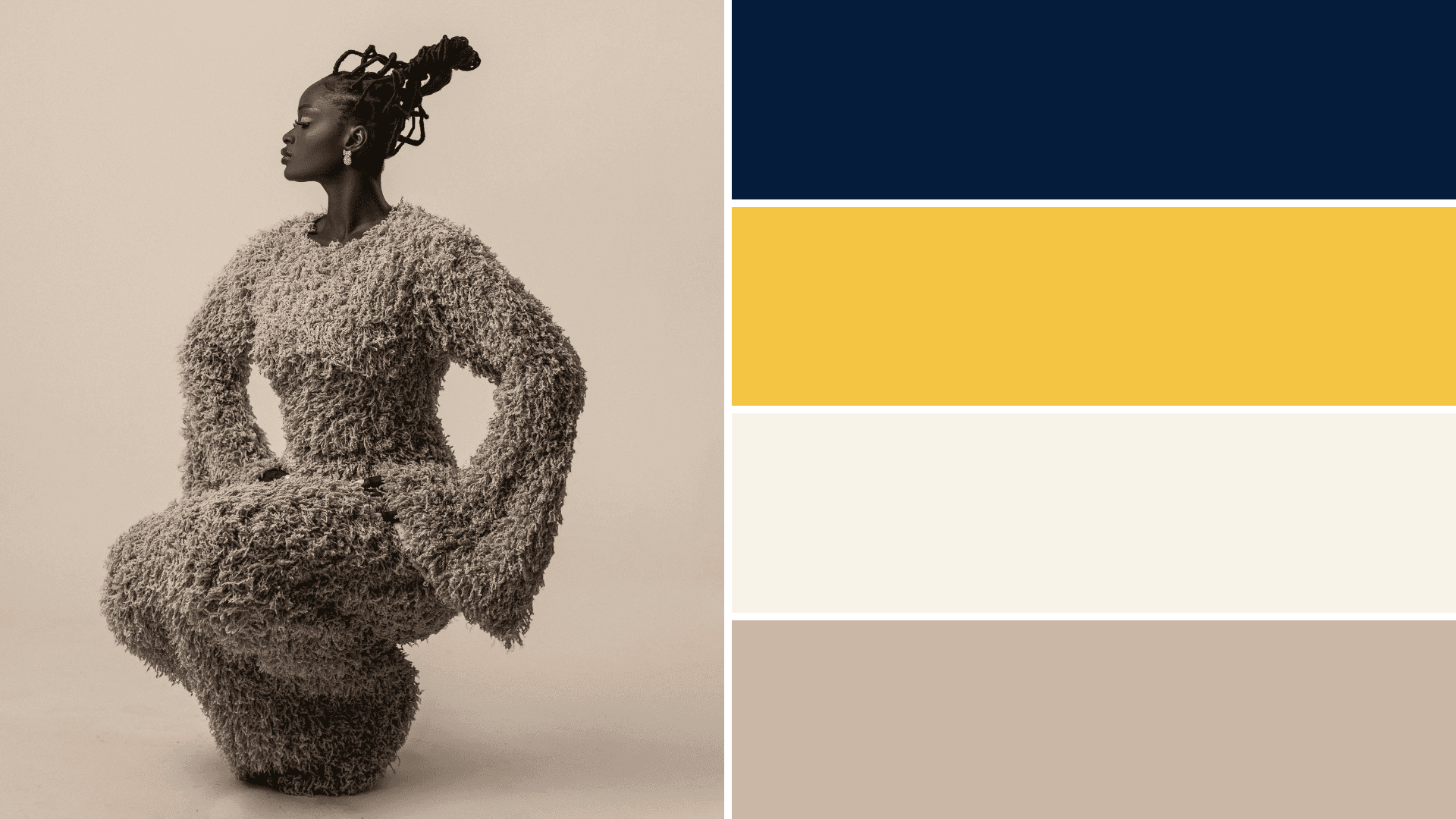
Above is an example of this trending color palette, inspired by luxury fashion.
Colors: Deep Navy (#051D3B), Metallic Gold (#F4C542), Cream (#F7F3E8) and Soft Taupe (#CBB7A6)
Why it works: Navy exudes depth and authority while gold adds prestige and celebration. Together they create a “polished, grown‑up” aesthetic. The high contrast between dark and light tones ensures readability and suits accessible email design.
How to use it: Apply navy or taupe as the primary background in email templates. Use gold for headlines and CTA buttons and cream to balance the palette. This combination fits luxury and high‑value campaigns, reminding consumers of what’s been spotted on runways and premium packaging.
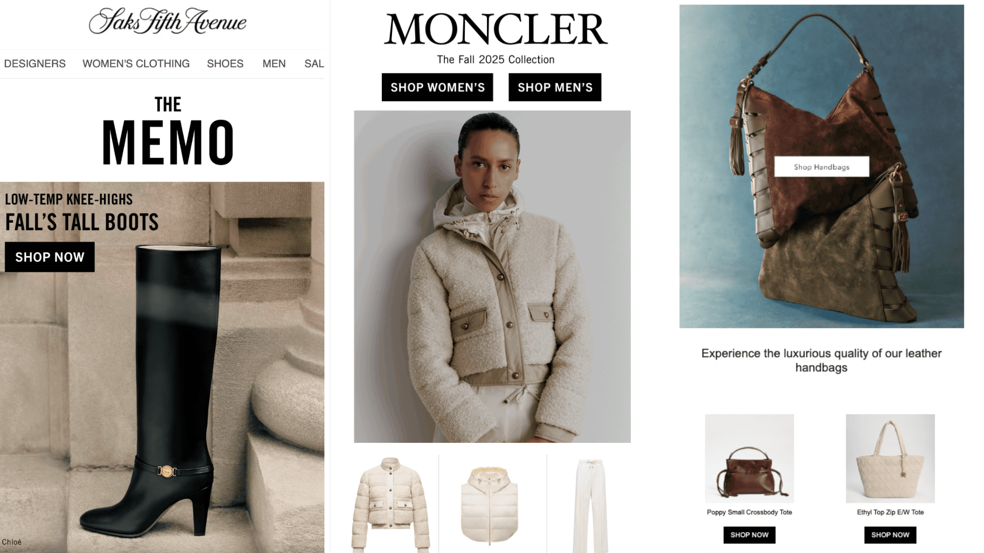
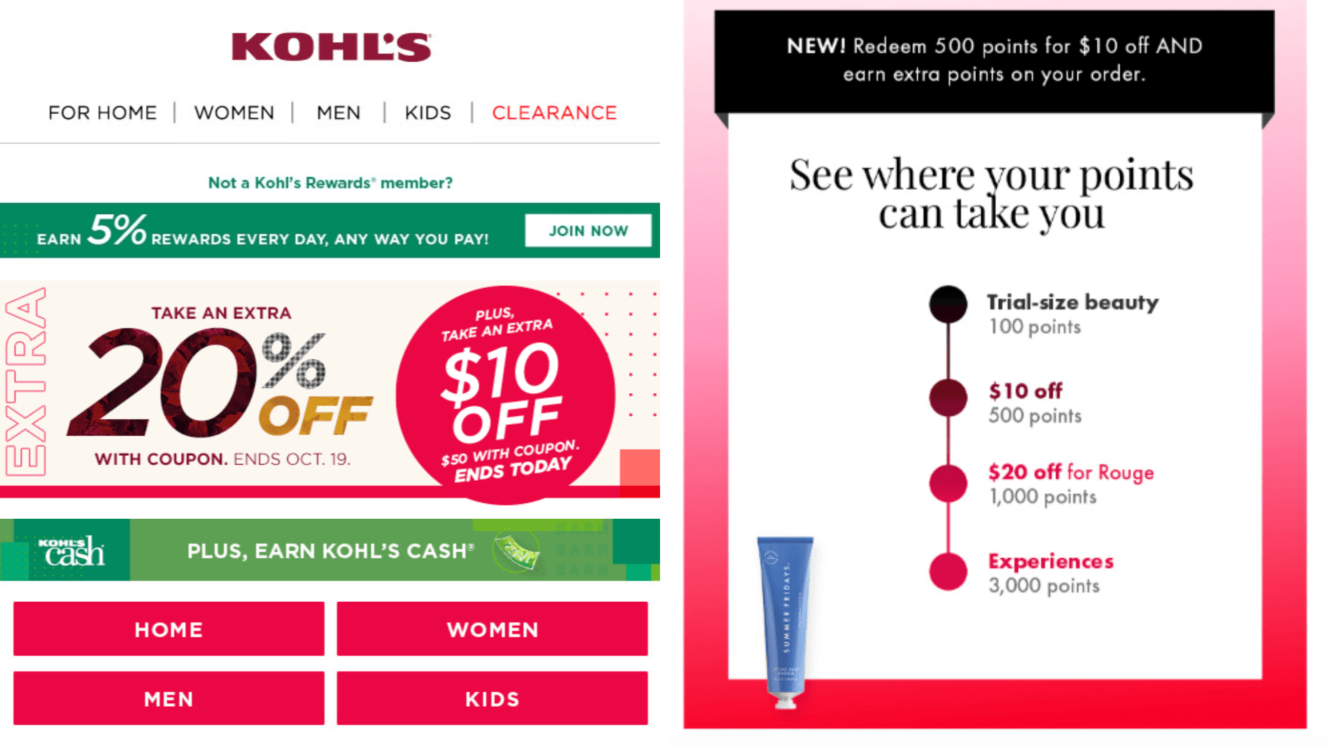
Check out these example emails, which use this color theory approach to convey luxurious campaigns with high-contrast CTAs.
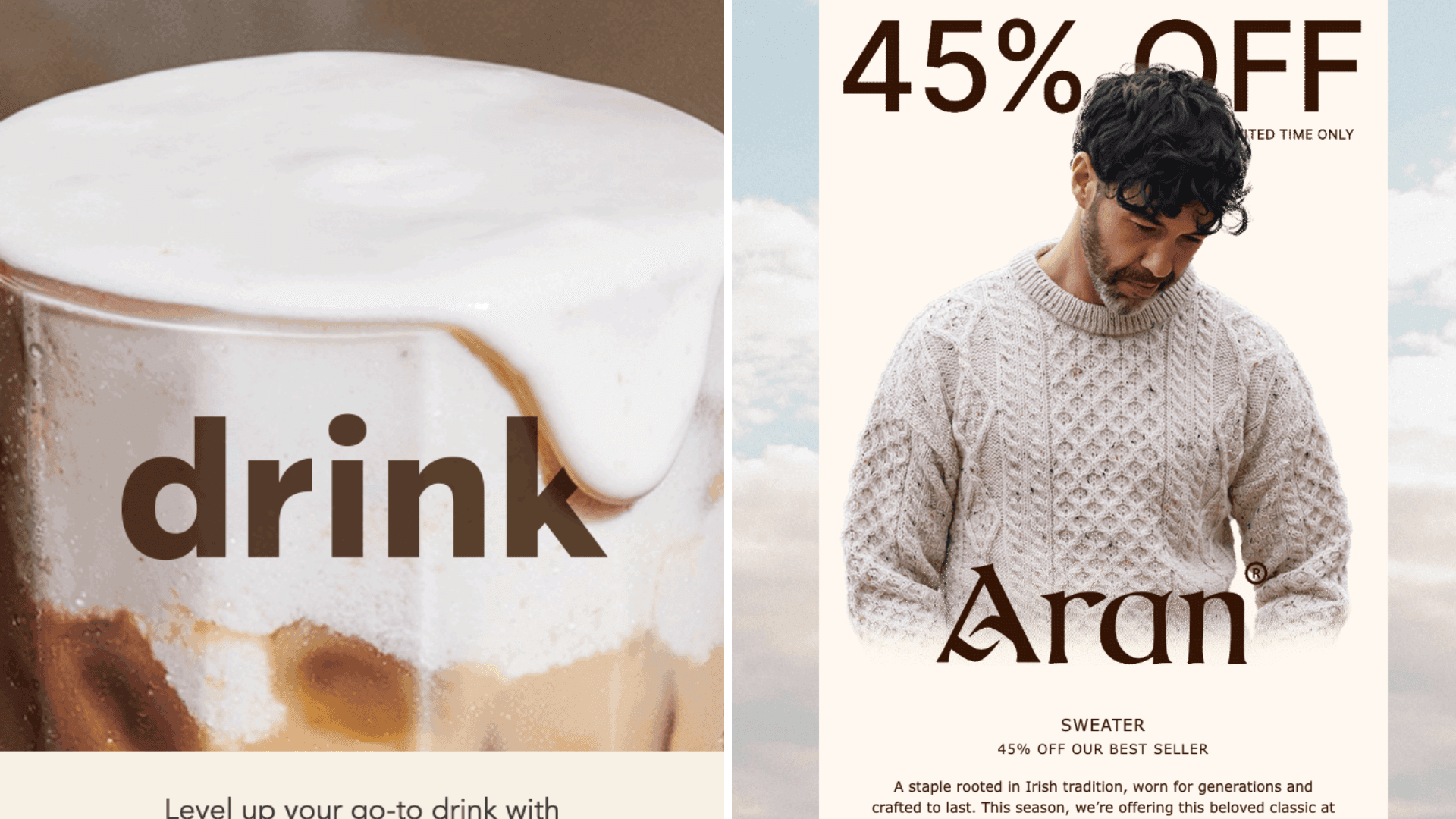
Sunshine Optimism: Butter Yellow, Mustard & Slate
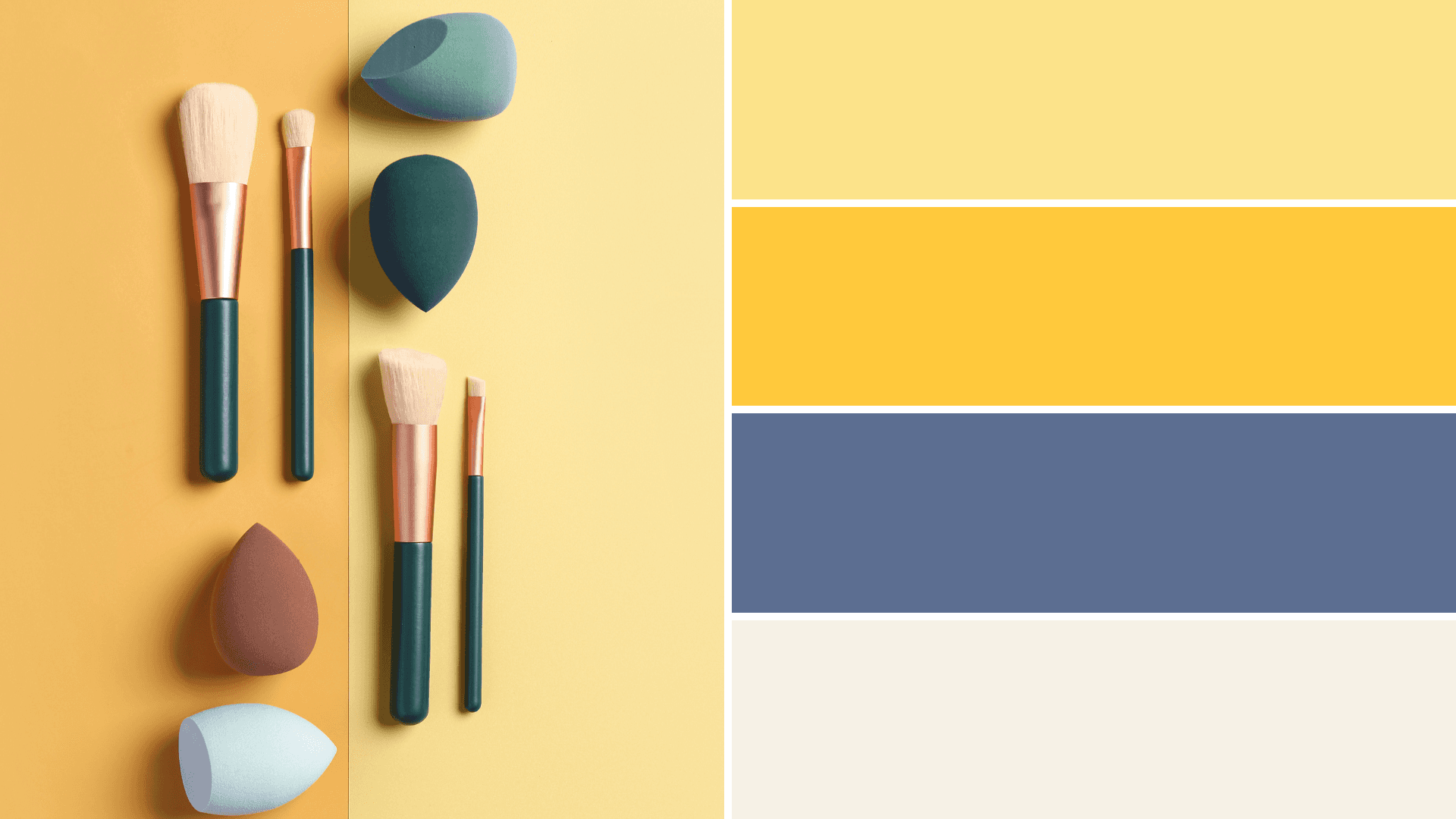
Colors: Butter Yellow (#FCE38A), Mustard (#FFC93C), Slate Blue (#5C6E91), Off‑White (#F6F1E6)
Why it works: Trending soft yellows convey hope and positivity, without the eye strain of neon tones. Trend reports note that designers offset yellows with mustard to provide depth. Slate blue grounds the palette, delivering contrast for text.
How to use it: Set a butter yellow backdrop for hero sections and off‑white for body content. Use mustard or blue on CTAs for emphasis. This palette suits cheerful, lifestyle‑oriented campaigns.
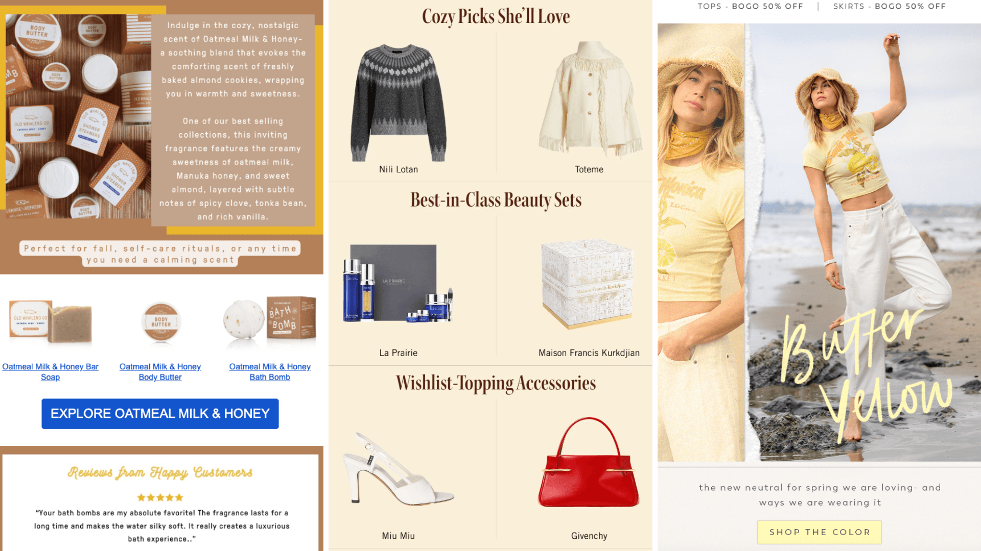
Warm colors with blue or yellow CTAs deliver a light and bright email experience.
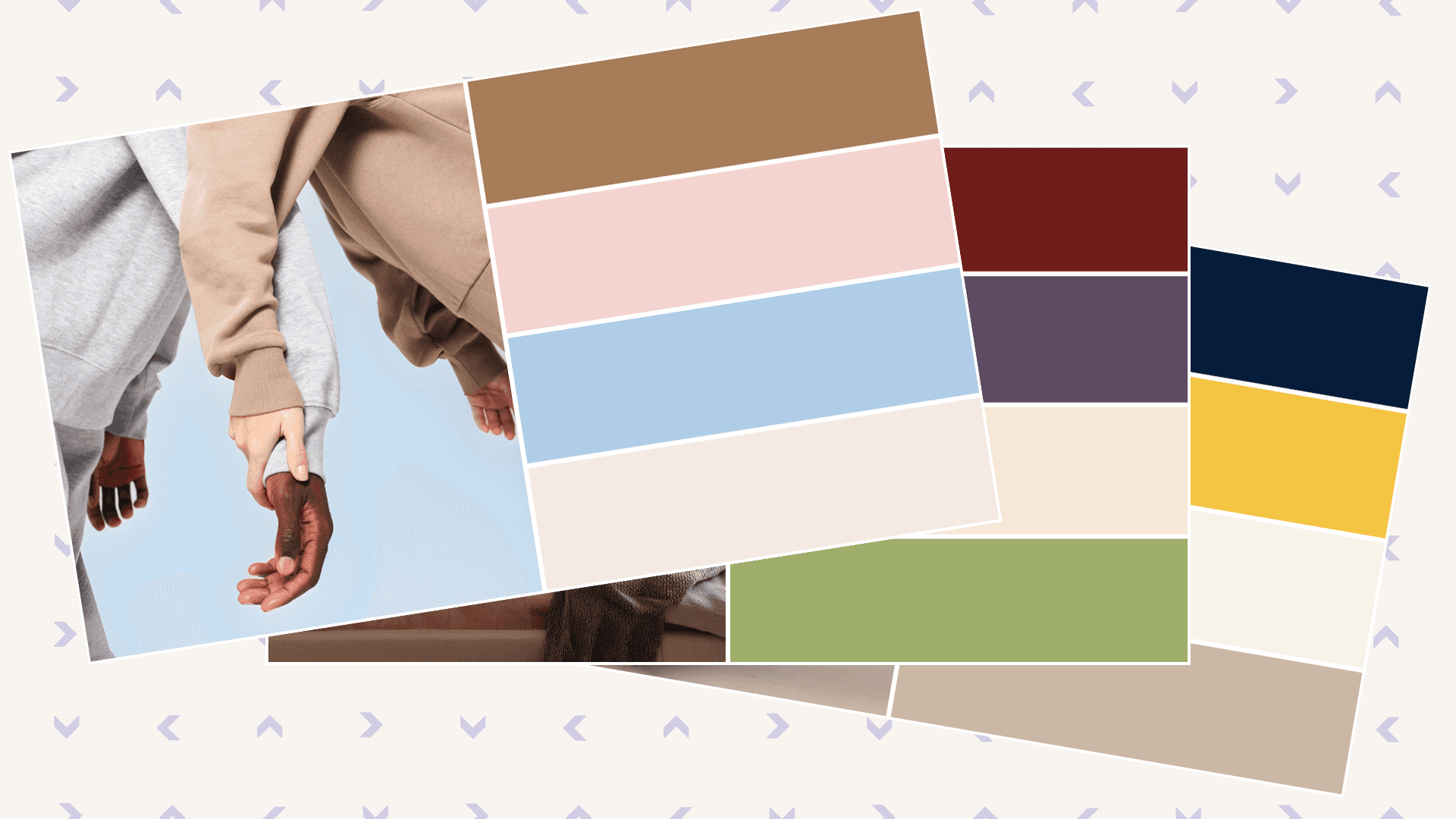
Dusty Reds: Rose, Cherry & Mocha
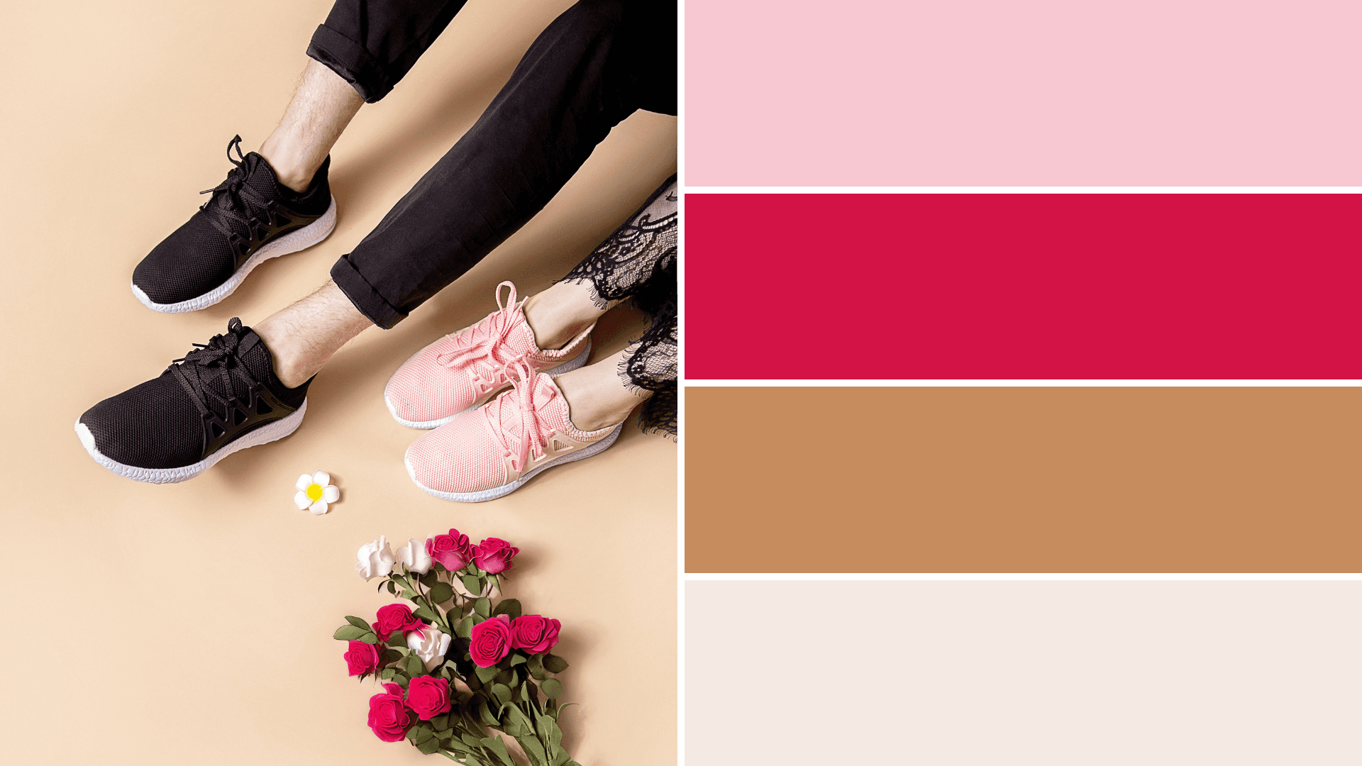
Colors: Rose Pink (#F7C7D2), Cherry Red (#D31245), Mocha Mousse (#C78C5E), Ivory (#F5EAE3)
Why it works: Rose and cherry red produce a dramatic, nostalgic feeling. Red triggers excitement, while pink softens the effect. Mocha Mousse anchors the palette and ties into Pantone’s 2025 neutral.
How to use it: Use mocha or ivory as the base. Balance red with neutral space to avoid overwhelming readers. Apply rose to highlight key sections, and cherry red for sale badges or CTA buttons. This palette is perfect for Valentine’s promotions, product launches or holiday campaigns.
Urgency of these to retail sales are conveyed through bold use of red and pink.
Earthy Comfort: Mocha, Pastel Pink & Sky
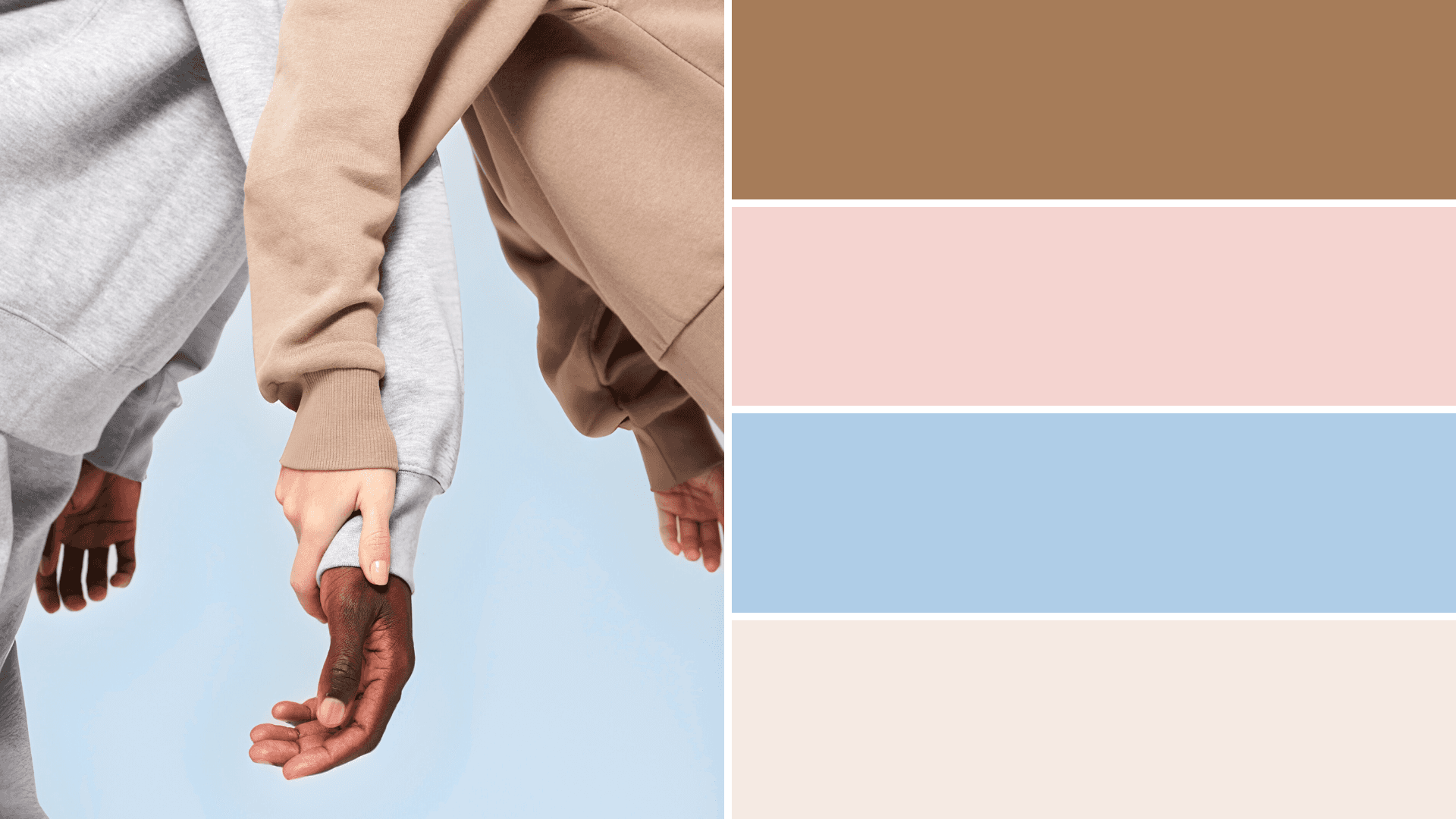
Colors: Mocha Mousse (#A67C59), Pastel Pink (#F4D4D0), Sky Blue (#AFCDE7), Cream (#F8F5F2)
Why it works: Earthy browns tap into consumers’ desire for calm and authenticity. Pastel pink and sky blue add serenity and freshness. These combinations align with biophilic design trends and sustainable brand stories.
How to use it: Make mocha your primary canvas. Use pastel pink for headlines or banners and sky blue for accents like icons or buttons. Cream backgrounds improve readability. This palette suits wellness, sustainability and lifestyle brands seeking a grounded aesthetic.
Whether we’re talking iced lattes or warm sweaters, these colors communicate cozy comfort.
Jewel Tones: Burgundy, Eggplant & Champagne
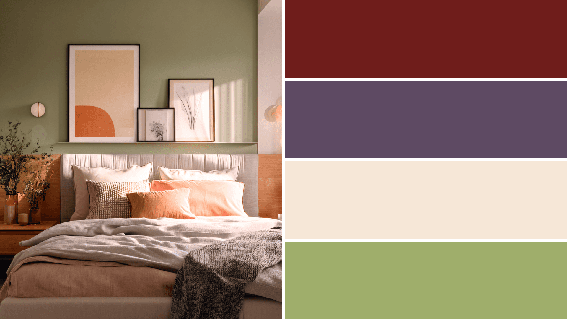
Colors: Burgundy (#6F1D1B), Eggplant (#5E4A63), Champagne (#F6E7D7), Sage Green (#9FAE6B)
Why it works: Jewel‑like hues communicate luxury. Burgundy and eggplant offer a gender‑neutral alternative to pink and blue. Light champagne and sage maintain contrast while preventing design from feeling too dark.
How to use it: Use champagne or sage for backgrounds. Apply burgundy or eggplant to headlines, icons and CTAs. Add sage green accents for a fresh touch. This palette works well for upcoming holiday and BFCM promotions and premium product launches. High‑contrast text and ample white space ensure accessibility.
From family holidays to high-end luxury, jewel tones make messaging hit a rich mark.
Best Practices for Accessible Emails & Mobile‑Friendly Email Designs
Limit your palette. Stick to three colors to keep your email readable and coherent. Limiting your color palette cultivates emotional response without confusion, and data shows it increases click and engagement rates when compared to more complex palettes.
Use high contrast. Choose dark text on light backgrounds or vice versa. The boldest color should highlight CTAs.
Test dark mode. Invert your palette to see how colors behave on dark backgrounds. For example, in the Sunshine Optimism palette, slate blue can serve as a dark‑mode base with butter yellow accents.
Segment and test. Preferences vary by demographic. When looking at gender, men often prefer brighter or achromatic colors, while women tend to respond to softer tones. Run A/B tests to refine your palette choices.
Always design for mobile. Use single‑column layouts, scalable fonts and large touch targets. Compress images to reduce load times. Make sure text remains legible on small screens and never forget to add alt text to all your images, in order to make them as accessible as possible.
Consider color blindness. Incorporate patterns or icons to supplement color cues. Avoid relying solely on color for status messages or alerts, as a means to prioritize inclusivity in your designs.
Future Outlook for 2026 Email Design Trends
After this holiday season, email design trends will keep evolving into the new year. Early signals suggest a continued emphasis on authenticity and sustainability, with organic textures and nature‑inspired illustrations. Following these developments will help you create campaigns that feel current as email design trends 2026 unfold.
Colors aren’t just decorative. When used wisely, they become strategic tools. Marketers should choose schemes that fit your brand’s vibe and voice, test them with your audiences and refine your approach as trends evolve. When your colors align with your message, you create emails that are not only beautiful but also effective.
AI content generation and template design takes ecommerce email effectiveness even further.